Building a user friendly and scalable
banking solution for the future

UX Research

UX Design

Branding

Content management system

Mobile/web

Design systems

2022

2022

2022

Nedbank ReImagine

Nedbank ReImagine

Nedbank ReImagine

Overview

The Nedbank Re-imagine project involved redesigning Nedbank’s commerce banking experience through taking a user led approach and developing a scalable content management and design system.

Problem

Problem

Problem

The challenge was to shift the companies strategy from a traditional approach to a design-led, data driven and adaptable approach to the user experience that would create a scalable experience underpinned by a smart cloud based content management system and responsive mobile first design system.


Solutions

An improved customer journey that captures Nedbank's brand identity, built on the basis of a scalable content and design system, while also elevating their sales and service interactions to distinguish them from competitors in the financial sector.

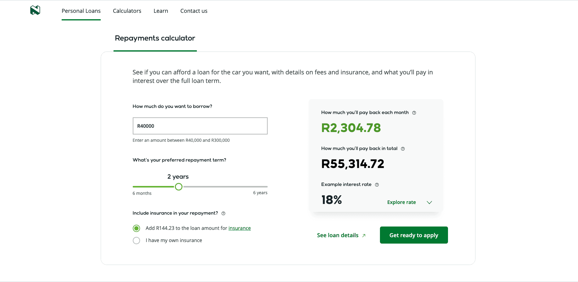
The Reimagine project started with two MVP's, Personal Loans and Credits Cards, before scaling to other products and the entire Nedbank Public facing website.

Selection wizard

Feature

Nedbank customers found it difficult choosing the right credit card and benefits, so we decided to develop a wizard that shows you different credit cards based on your selection. You could select up to 3 categories. This meant working closely with the product team to develop this feature.

Mobile first design

Approach

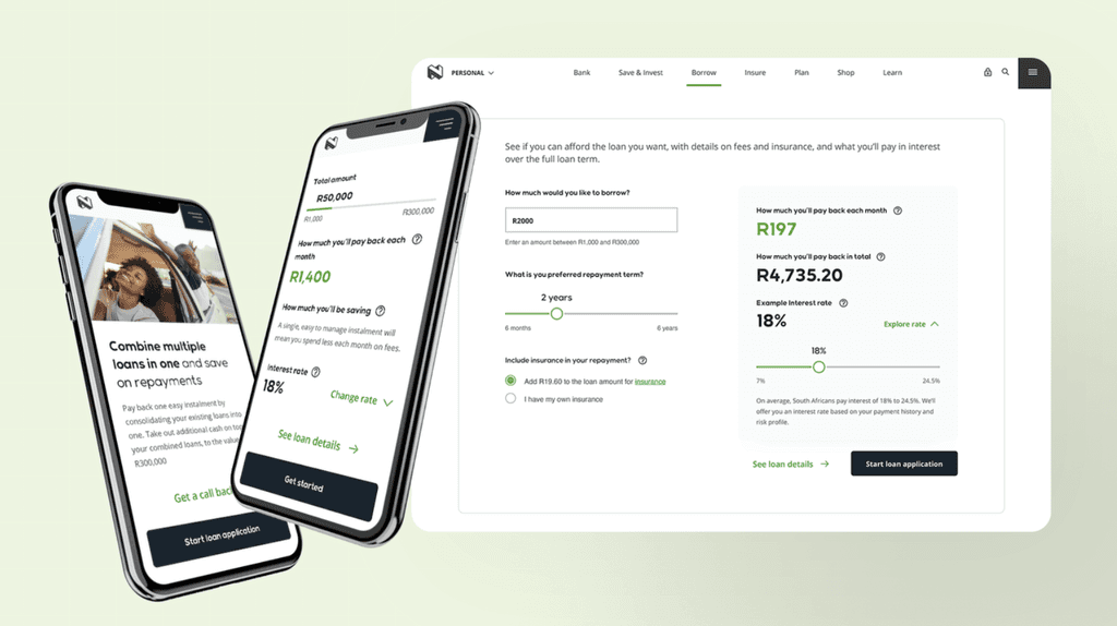
Adopting a mobile-first strategy enabled us to streamline the content within the limitations of mobile devices. By adhering to responsive design principles, we could create components that would adjust and stack according to different devices and breakpoints.

Card selection
Wizard

Feature

Nedbank customers encountered challenges in choosing the most suitable credit card and its associated benefits. To assist and streamline their decision-making process, we devised a wizard. This tool presents various credit card options tailored to your chosen categories. The user has the flexibility to select up to three categories, allowing for more personalised recommendations. Collaborating closely with the product team, we developed this feature to enhance user experience.

Mobile first design

Approach

Adopting a mobile-first strategy enabled us to streamline the content within the limitations of mobile devices. By adhering to responsive design principles, we could create components that would adjust and stack according to different devices and breakpoints.

Insight

Insight

Insight

A responsive design system, customer-centric interfaces, and a mobile first design approach are vital for financial institutions to adapt to market demands, delivering dynamic and pertinent information and user interactions

22% Lead generation

Simplified
user journeys

Scalable
Design system

Client
Nedbank

Company
Foolproof

Company
Senior User experience designer

Company
Senior User Experience Designer

Company
Senior User Experience Designer

Year
2023

Industry
Financial Services

What we did

Wireflows

User Journeys

Wireframes

Brand research

Design Systems

Team and responsibilities

Our team, which worked alongside a larger development team through Zensar, involved around 30-40 people, including product owners. My responsibilities as a Senior UX designer included leading key aspects of the project, owning wireflows to ensure comprehensive journey coverage and logical flows, collaborating with the content team, and maintaining consistency with the UI designer. Key responsibilities encompassed planning, conducting and analysing formative and evaluative research, communicating insights effectively, advocating for the user in multidisciplinary teams, providing strategic direction to clients, and prototyping for continuous feedback and iterative development.
Respondent overview

Understanding who would be best to speak with

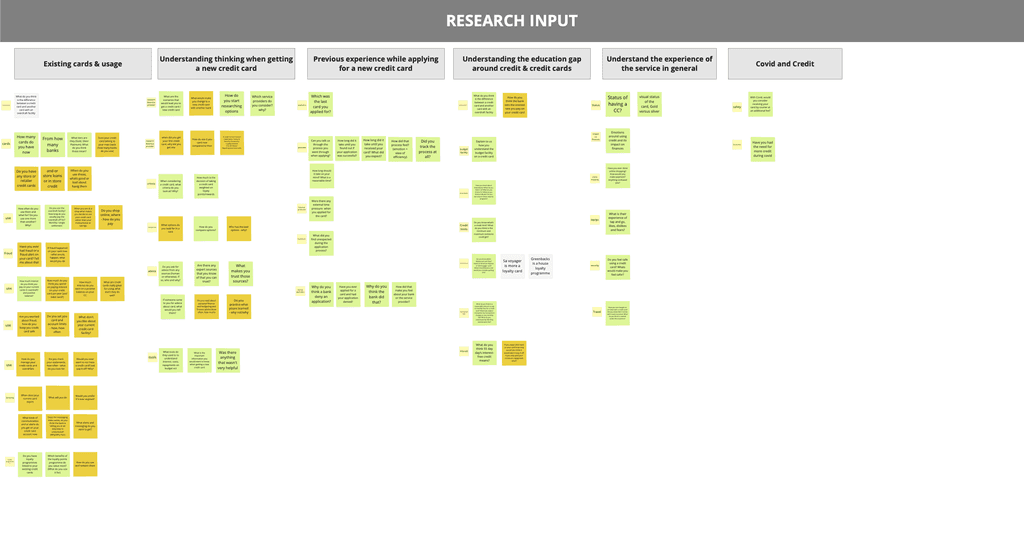
Research input

Planning what we want to find out from the informants

Affinity sorting

Sorting the data from various users

Insights analysis and feedback

Presenting findings within the teams to gain more context

Qualitative research strategy

Working along the CX lead, our process for research as a Senior User Experience Designer was the following:

Respondent overview

Understanding who would be best to speak with and why

Research input

Planning what we want to find out from the informants

Affinity sorting

Sorting the data from various users

Insights analysis and feedback

Presenting findings within the teams to gain more context

Discovery and Research process

ACTVITIES

ACTVITIES

DESCRIPTION

DESCRIPTION

OUTCOME

OUTCOME

Context

Context

Understanding the context of the product we are designing for, this involved activities like mapping with CX lead, briefing with product owner, checking whats been done on the previous site ect

Understanding the context of the product we are designing for, this involved activities like mapping with CX lead, briefing with product owner, checking whats been done on the previous site ect

Mapping Miro board to understand key aspects of the problem

Mapping Miro board to understand key aspects of the problem

Competitor analysis

Competitor analysis

Understanding what other competitors in similar industries are doing and doing inspiration research for UX best practices

Understanding what other competitors in similar industries are doing and doing inspiration research for UX best practices

Collation of features mapped on the Miro board. Components from UX best practice to understand what competitors have done for similar products

Collation of features mapped on the Miro board. Components from UX best practice to understand what competitors have done for similar products

Scoping and Defining

Scoping and Defining

Defining what we want to learn and what are the main focus areas. This usually a workshop on Miro to define categories ect

Defining what we want to learn and what are the main focus areas. This usually a workshop on Miro to define categories ect

Plan for research to brief to the research agency

Plan for research to brief to the research agency

Briefing with Research Agency

Briefing with Research Agency

Briefing the research facilitator who would undertake the interviews

Briefing the research facilitator who would undertake the interviews

Dry run and interview guideline

Dry run and interview guideline

Interviews

Interviews

Preparing Miro and taking notes notes during interviews.

Preparing Miro and taking notes notes during interviews.

Notes for each focus area of each participant

Notes for each focus area of each participant

Synthesis

Synthesis

Once all the interviews had been undertaken, as team we would start with affinity mapping and process of grouping and interpret themes and insights from the research

Once all the interviews had been undertaken, as team we would start with affinity mapping and process of grouping and interpret themes and insights from the research

Qualified and quantified insights

Qualified and quantified insights

User Journey

Based on the results and insights from the users we would start to set the direction for the user journey. These involved the following activities:

ACTVITIES

ACTVITIES

DESCRIPTION

DESCRIPTION

OUTCOME

OUTCOME

Information architecture

Information architecture

At that same time we were working on the Information Architecture of the site, to understand the users goals and perception of language and where things should be.

At that same time we were working on the Information Architecture of the site, to understand the users goals and perception of language and where things should be.

Organisation and the hierarchy of information based on the users needs

Organisation and the hierarchy of information based on the users needs

Higher level flows

Higher level flows

This involved mapping the higher level flows.

This involved mapping the higher level flows.

Mapping the Miro board to understand the flows and hireacy of information based on the research

Mapping the Miro board to understand the flows and hireacy of information based on the research

Wireflows

Wireflows

Developing a higher fidelity by mapping out the flows and low fidelity wireframe, this created alignment between teams

Developing a higher fidelity by mapping out the flows and low fidelity wireframe, this created alignment between teams

Connected flow maps on Miro, that show the logical flows and create alignment between teams

Connected flow maps on Miro, that show the logical flows and create alignment between teams

Wireframes

Wireframes

Designing components and structure of interfaces based on scenarios and user goals

Designing components and structure of interfaces based on scenarios and user goals

Wireframes that act as blueprints and speak to the system

Wireframes that act as blueprints and speak to the system

Also check the case study from Foolproof

Foolproof case study

Key takeaways and learnings

Teams working remotely can achieve great things if there is a great culture and it's managed in the right way

User research lays the direction for the architecture and higher level flows

Working with tools such as Miro and Figma are effective in product development for mapping, workshopping and documentation

Wireflows are essential for team alignment and research alignment

Working closely with UX Writers and Product Owners to align on content and business rules is essential in the financial sector

© Ideaflow Studio. 2024